| |||||
The Myth of Electronic PublishingThe metaphor, "electronic publishing," to describe the web is simply wrong, and the source of some of the worst design on the web, because the techniques that work to make a successful printed page, often do just the opposite on the web. When attempting to locate sites that are worth emulating you should be looking for successful sites, and not sites that the viewer thinks "look good" based on their own subjective opinion. It's very easy to determine which web sites are successful - they are the ones with the most visitors. There are multiple ranking sites that can help you find these. The 10 that I am going to examine are based on Mediametrix's list of the top 50 web sites from July 1999. There are other lists but all they do is move some sites up or down a few spots. No one can reasonably question that these 10 sites have massive traffic volume. I wrote this over 14 years ago and believe it to be as relevant today as it was then. I've had to make some small adjustments because sites have changed dramatically, and some things that I referred to no longer exist. Nothing of what I meant to say then has changed. When looking at these 10 sites there are a number of characteristics that they tend to share; not surprisingly most of these characteristics are discussed in the literature on web site design. An excellent crash course on web design was provided by CIO Web Business Magazine titled "Must Haves" at http://www.cio.com/archive/webbusiness/080198_main.html It's gone now, but can still be found at https://archive.org at the old URL. It discussed "12 essential" elements for a successful web site. These were:
Most remain relevant, but some show how much times have changed. It's hard to imagine anyone who develops a website, not knowing how to link to any external site or web page they are viewing. This is still relevant for sites which want to control links to their site. Easy to use tools and traffic reports show how far the web has come; now its more like information overload trying to decide which of the many, open source and commercial, web content management systems and reporting tools, best suit your needs. After 18 years of working on websites, I'm still stunned at how many sites obviously do not have a style guide or standards or any sense that a site should present a consistent appearance.
Because the sites that still exist are so dramatically different
than they were 14 years ago, I decided screenshots of how they looked
in 1999, make more sense than links to the current sites.
All of these pages are the respective intellectual property of the
companies whose names appear on these pages or the companies who have
since bought or merged with them. All the pages are copyrighted and
have trademarked content belonging to their respective owners. I
belive a look back at what the home pages, of 9 of the top ten
websites, looked like over 14 years ago, reasonably qualifies
as fair use. If any owner disagrees I can be reached at
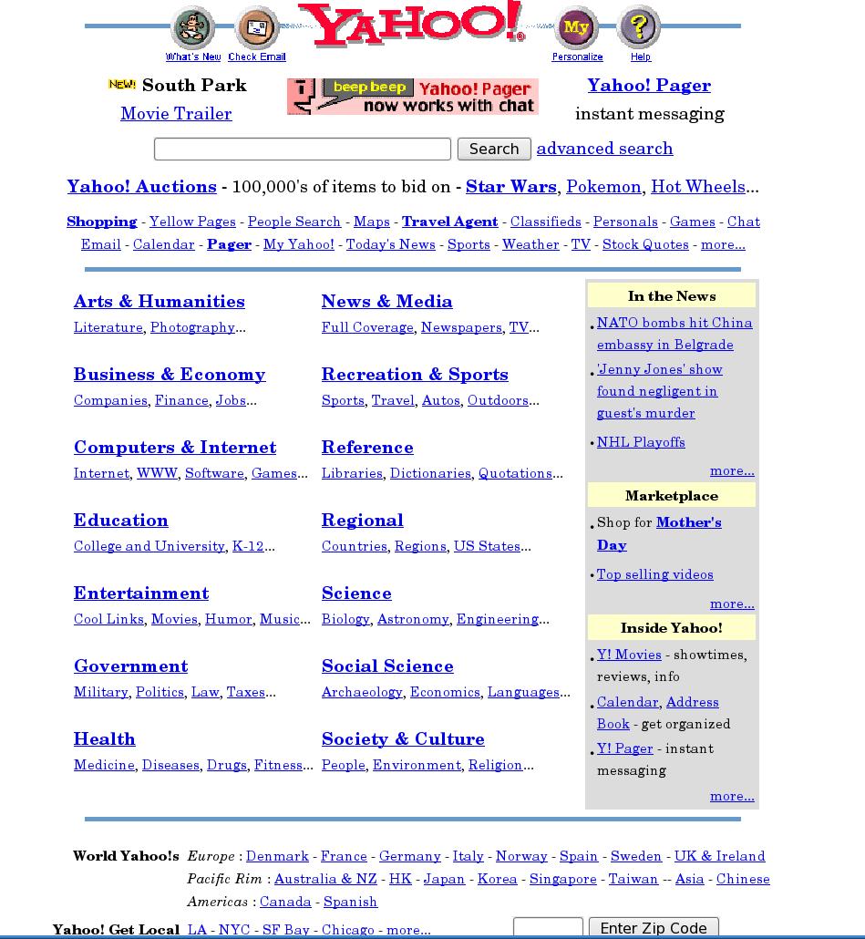
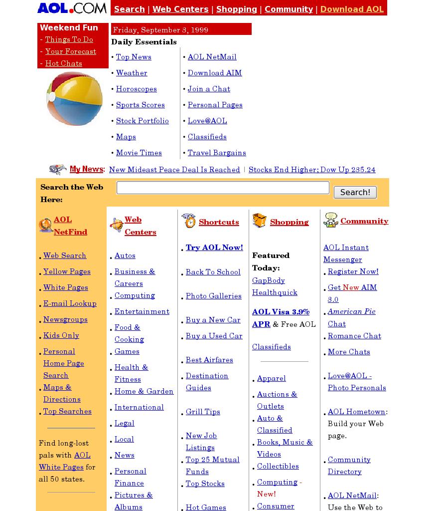
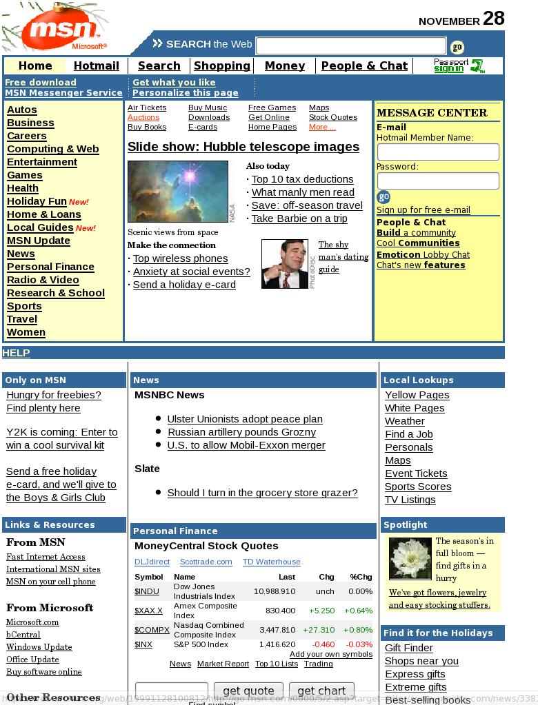
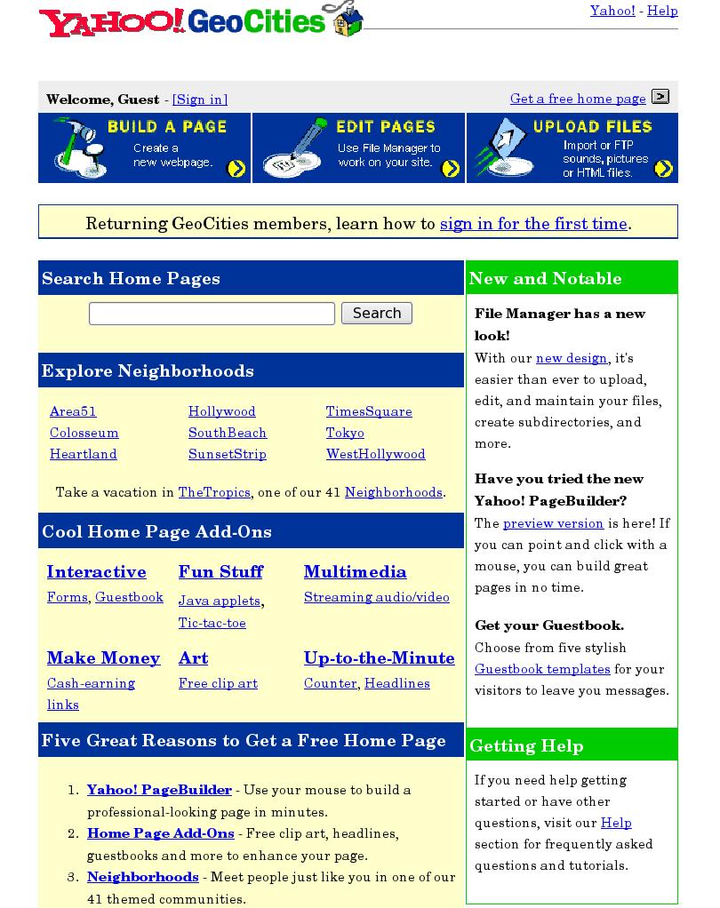
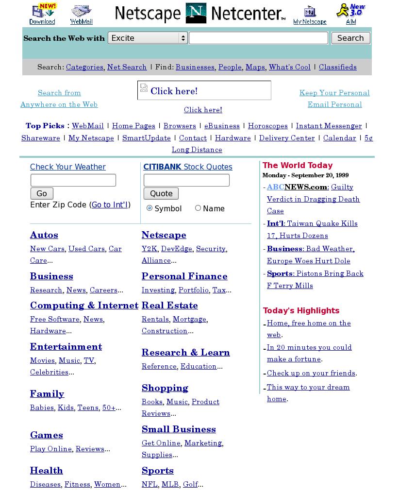
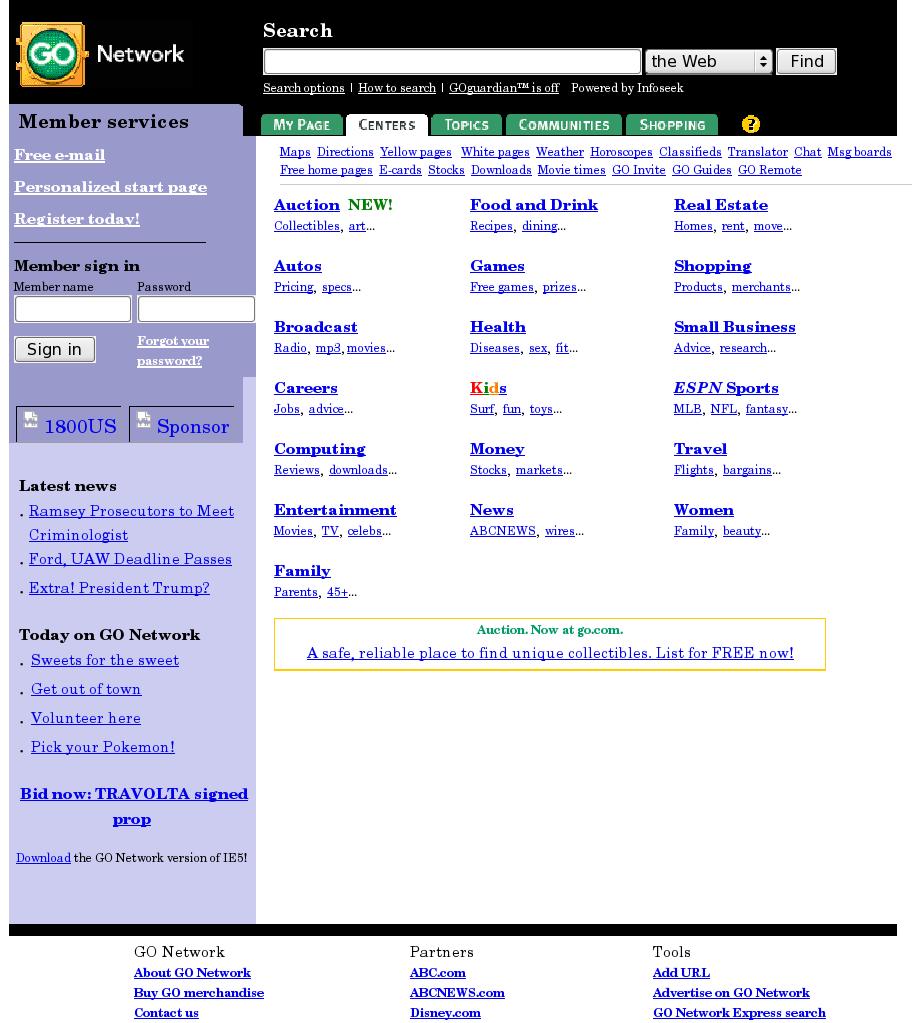
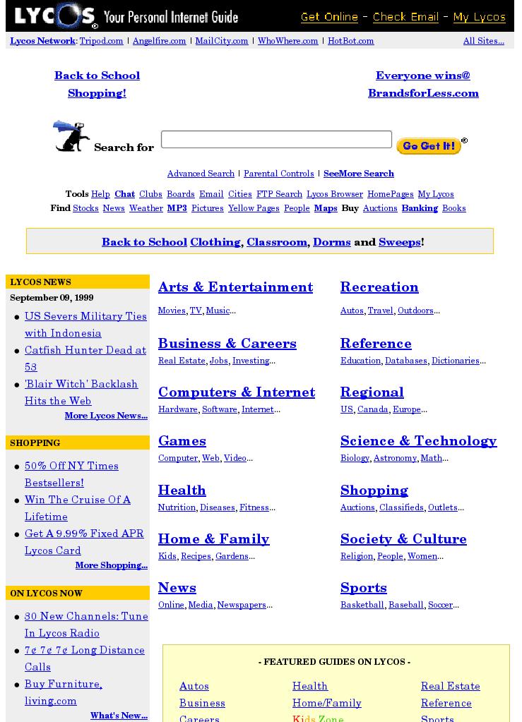
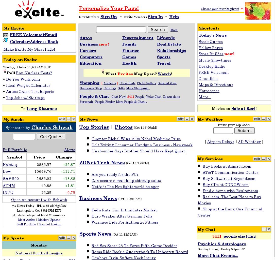
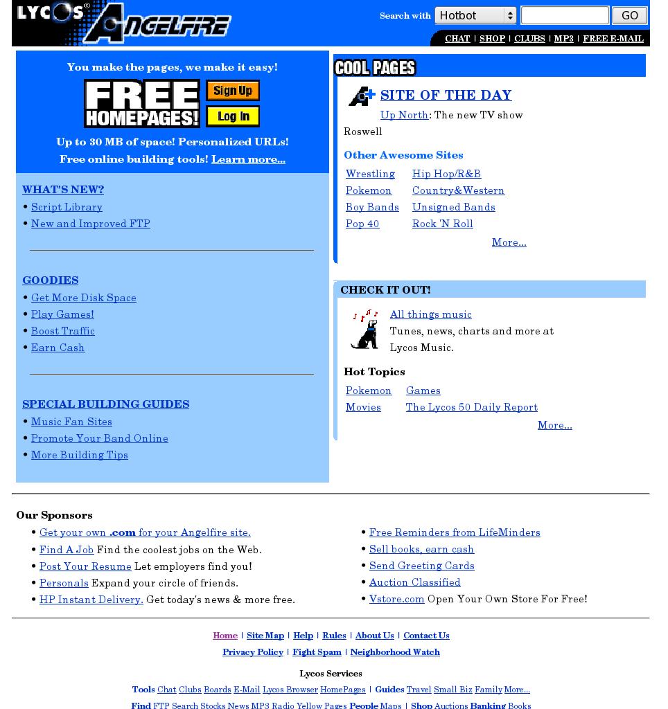
- www.yahoo.com I'll discuss how these sites have changed at the end of this page. All 10 sites are almost entirely text based with very limited use of graphics. The one graphic element, that every top 10 site uses on every page, is the site or company logo. The other graphics are limited to small navigation aids and paid advertising. Only one, Geocities, had a full size banner ad on its home page. AOL had 4 third to quarter size banner ads and Angelfire had three similar sized paid ads. Yahoo, Netscape and Lycos each had one tiny banner ad in a very prominent spot. Yahoo sometimes used this spot for promotion of its own services. (Most ads disappeard from the Archive.org content.) Other than Yahoo's use of its banner spot, not one of these sites used any graphic to promote its own services. Only two sites had any photographic image of any kind on its home page and these are tiny. All use white backgrounds. Anglefire used to use a yellow so pale that off-white is a reasonable description; they have switched to pure white with some significant blue areas. Geocities uses some large pale yellow areas on a white background. Yahoo, Geocities, Go, and Lycos use browser default text colors and fonts. The others stay with very conservative variations from the defaults, i.e. text and links are blue to dark blue, dark grey or black. All fit comfortably in a browser window that would fit on an 800 x 600 monitor. Most would fit comfortably, i.e. without horizontal scrolling, in a 640 x 480 monitor. Note, this was all true in 1999; when I opened these pages in a browser that filled most of a 1920 pixel wide monitor, they all expanded horizontally, i.e., all were designed to use the space available. You might try resizing your browser to see how this page adapts. In doing so myself I realized my text lines grew too long to read easily when the browser got very wide. As a result I set a page width limit and slightly narrowed the navigation aids column throughout the site. Otherwise, all page dimension settings have remained unchanged on all pages since I designed this site design in 2000. All top 10 sites have small home page sizes ranging from 18K at Yahoo to 63K at Microsoft. Its interesting to note that the two largest home page sizes belong to sites with "captive" audiences. The next closest in size is MSN at 40K and is much smaller than the two relatively big ones. AOL (62K) has over 20 million members and when they install their software, the AOL home page is their home page; many / most users never bother to change their browser home page. Microsoft is the largest software company in the world and if you want authoritative information on their products, free downloads and upgrades or free tech support you go to their web site. Not one of the top 10 sites looks like it was designed by a graphics designer. Every one does look like it was designed by an experienced software designer. When you compare the appearance of the top 10 sites to any printed material, including printed material from these same companies, the web sites vary in look from plain to cluttered. Not one is "pretty" or "attractive" when compared to typical print media. The web has often been referred to as "electronic publishing." This is wrong. Every web site is a computer application system regardless of whether its purpose is the delivery of information or the sale of products or services or some combination of these. The publishing metaphor comes from the days when web sites were made from a series of static pages. Today every significant web site has a large portion of dynamic content. Many important sites are totally dynamic in that every page is drawn from information in databases and turned into HTML when a user clicks on a link. Many adapt to the users interests or allow the user to find information of particular interest or assist in the purchase products or services similar to those they have previously purchased. Even if a site is entirely static, if it is of significant size, it needs to organize its content in a manner that makes it easy for visitors to locate what they are looking for. Hypertext is inherently non linear in contrast to all print publications. Every page needs navigation aids or a consistent set of buttons or links to major areas of the site as well as ways to easily move to the next and previous page where sequential information is contained on more than one page. Every page should have a direct link back to the home page. The primary way that visitors find a site is from search engines, which will often take the visitor to a page deep within the site's structure. There is nothing analogous to this in the print world. If the publishing metaphor was ever valid, it is now about three years out of date. All the experience and training that a graphic designer brings to designing web sites or pages works against creating a successful web design (I have a degree in commercial arts). A graphic designer is used to working in a medium in which he or she has total control of every element that appears on the printed page. Size, proportion, color and even paper stock are either specified by or known to a graphic designer. None of these are knowable or controllable by a web page designer. Though all modern browsers allow the display of images and sounds, the browser user can and often does turn these off. The browser user can override all color, font and font size specifications provided by a web page. Monitors range in size from 640 x 480 to 2000+ dimensions. Especially on larger monitors, browsers are rarely used in full screen mode and the browser window can be either horizontal or vertical in its orientation. Colors available range from 16 to millions. In the print world, color costs more to produce, but except for this difference a magazine reader can flip past any page at the same speed. The designer must find ways to get the reader to stop on the page he or she is designing. The designer can apply every ounce of creative effort to catch the readers attention and there is no difference in delivery time of the most complex visual experience the designer can create and a single word in black on a white page. In popular music, video and book cover design the graphic designer needs to do anything that works to get a potential buyers attention. A designer of brochures for direct mail or display racks has to get the viewers attention so the mail piece does not land in the trash unread or the brochure is picked up from the rack or table. Just about every thing that works for you in print works against you on the web. What you need from the graphics design world is an understanding of basic color theory and some very basic typographic principles. These are that all uppercase is harder to read than mixed case, serif type faces are easier to read in large blocks of text than sans serif faces, good design resists the desire to use a wide variety of type faces, styles and sizes on one page and that you need to be very careful if you plan to use a light color text on a dark background. That's your instant course in graphic design for the web. Every person reading this document is a computer user and each of you knows that one of the most annoying aspects of using computers is waiting for the computer to do something while you sit there. It doesn't matter if it's loading a large program on a slow computer, retrieving a really large word processing document, waiting for a report or large spreadsheet recalculation or especially waiting for the computer to reboot after a crash. Any time the wait is over 10 seconds the user is likely to start doing something else. At a minimum, attention starts to wander, but the longer the wait, the more likely the user is to do something else. For example, in a windowed environment, you might read e-mail while waiting for a report to finish. Waiting for web pages is no different, except the normal reaction to a really slow web page, is to hit the "stop" button and go elsewhere. On a 56K modem the top ten sites home page load times range from 5 seconds for Yahoo to 19 for Microsoft, the slowest of the top 10. Microsoft has a massive amount of content relevant to the large majority of computer users and not available elsewhere; if you want this information you have little choice but to wait for Microsoft's home page, unless a search result or bookmark is taking you directly to an interior page. The American Association of Critical Care Nurses, http://www.aacn.org, conducted a study of its member's internet access in mid 1999 and found that 30% were still connecting at 28K. Following their study they realized they had to make their site much faster. Their previous site looked like a very well designed association web site while their redesigned home page looked much like the top 10 web sites and not like a typical association web site. (Since this page was written in late 1999, AACN has reverted to a "pretty," graphics intensive, home page characteristic of most associations.) The largest ISP is AOL and AOL is a slow service provider. If you've had a chance to compare web access from AOL and a fast ISP with similar equipment you will know that web pages download much faster through a fast ISP than through AOL. A reasonable estimate is that pages take about one and a half time as long from AOL as from a fast ISP. This is relevant to anyone serving mostly a home audience via the web. Despite the growing availability of cable modems and DSL, most web sites will not be able to ignore the needs of modem users for a number of years. International Data Corporation has predicted that by the end of 2002 one third of homes in the U.S. will have high speed Internet connections. This means that two thirds will still be web surfing with modem connections (or still not connected). Another factor to keep in mind is that in-house web sites appear much faster to the staff than to the outside world. Typically an in-house web site will be no more than 3 hops away and connected at Ethernet or faster speeds. Ethernet is about 7 times as fast as a T1 line that typically connects small to medium size businesses to the rest of the world. Even when site visitors have a "fast" internet connection (T1, DSL, or Cable with speeds from 200K to 1.5MB) they still see the web pages significantly slower than staff do because in addition to their slower line speed they are typically going through 8 to 15 hops (routers, proxy servers, firewalls, computers) each of which adds a small delay. Also the bigger the web pages are, the sooner a T1 line will be saturated requiring a faster and more expensive connection to the Internet. Regarding the use of plugins, the book Web Style Guide: Basic Design Principles for Creating Web Sites by Patrick J. Lynch and Sarah Horton, Yale University Press, 1999, says 'Do not produce web sites that depend on one browser technology or browser plug-in ("This site designed for Netscape 4.05, and ShockWave"). Such notes on the home page of a corporate or enterprise Web site look sophomoric and will drive away most users old enough to drive.' Generally this book is quite serious in its tone. Clearly the authors have strong opinions on home page plug-ins, but it's a good point. None of the top 10 sites use proprietary technology or plugins. Even the two major browser vendors, Microsoft and Netscape, have developed their sites so that they are fully functional with their competitor's browser; some of the scripting used on Microsoft does not work in current Netscape browsers, but the site is designed so that these features are only a convenience and not necessary. All of the top 10 sites have stuck with technology that will work with almost any browser from the past 3 or so years. Today's web graphic tools make it very easy to do fancy graphic tricks such as buttons with bevels, highlights and drop shadows; all of these "cool" effects add significantly to the size of each button. None of the top 10 make any significant use of any of these "cool" effects. Readers may think that the top 10 web sites are so different from a small business web site that it's not reasonable to make comparisons. Lets examine what the top 10 sites are. Seven are portals, two are free web hosting sites and one is the worlds largest software company. Microsoft could probably use lousy web design and still have a successful site, though perhaps not in the top 10. They actually exceed their own recommendations on web page size. What's a portal? It's a web site that attempts to organize the entire world wide web experience so effectively that web users will make the portal's home page, the home page in their browser, so that it is the first page the user sees. In addition to providing a hierarchical categorization of the web, each includes a search engine, and at least some ability to personalize the portal home page to each user's special interests. Most include free e-mail, plus different kinds of chat or online forums. Basically these sites have nothing to sell but organization of the web, but they do it so well that seven of them are in the top 10 web sites; who better to study for how to organize a web site. Yahoo used to have direct links to major online vendors but not anymore. Now they have a shopping area. You can buy just about anything that's sold on the web through Yahoo, but its not easy to get out of the Yahoo site. Yahoo is so big that if an online vendor wants to be included they have to partner with Yahoo. You might actually buy a book or tape from Amazon.com but you're still in Yahoo pages, and Yahoo gets a cut of every sale made through it. Even if you do find the link directly to Amazon, I'd bet there is tracking so that Amazon still gives Yahoo its cut if you came from their site. Yahoo is so big that its virtually essential to be included if you want to be commercially successful on the web. They have done all this by being the best guide to finding other things on the Internet. They have always stayed a step or two ahead of their competition and I don't think it's any coincidence that the number one web site has about the smallest home page of any web site you can find. Its interesting to compare the last 10 of the top 50 web sites to the top 10. These sites tend to be more focused on a single subject than the top ten but most of their design principles are pretty much the same. What separates 41 - 50 from 1 - 10 is that they tend to have a lot more graphics and have an average home page size that's almost twice the size of the top 10. Their average home page size is just a little smaller than Microsoft's home page. Still not really bad, but these sites are typically among the leaders in their specific area, and have lots of substantive content that appeals to a large audience. Another metaphor that's fundamentally wrong is "browsing the web." This suggests some casual meandering without any specific focus. My personal experience and observations of others is that nearly all web activity is purposeful in nature. There are five ways to get to a site: 1) type in a URL, 2) use a search engine, 3) follow a link, 4) select a favorite or bookmark, 5) select from your history list. The first two are clearly purposeful suggesting a deliberate action to go to a location that the user hopes has a particular type of information or product of interest. The fourth and fifth are even more purposeful because a user is deliberately returning to a site that they have been to previously and know what to expect. The third is the only one that might take on a meandering quality. This occurs when the user clicks on a link that appears to lead to something unrelated to the user's original purpose. Even in this case, while the big picture may be one of not clearly directed action, each time a user selects a specific link they are making a choice to go to a location that they think has something of interest to them; it's not really relevant that the user has become side tracked from their original goal. If you think about what "browsing the web" implies, why would any web site want casual browsers except to increase advertising revenue based on impressions? Traffic that has no interest in the content offered by the web site but only the site's appearance is of little value to the site. You should want visitors that are interested in your products, services or point of view. These are potential customers, members or supporters. I hope this has succeeded in convincing readers of the need to make web sites clean and functional and to forget about trying to make them pretty or "designed." Every organization can choose between a site that staff and managment think "looks good" and one that provides the maximum functionality for visitors who come to the site looking for information or products or services they may buy. It's the choice between a collective ego trip and making a site that compares well with the best that the web has to offer. 2014 and BeyondObviously the Internet is much faster today than 15 years ago. In most situations people want and expect to see graphics. Even with intangible things like software, people want to see screen shots. Rather than suggest any limits on total page size, I'd suggest that anyone creating a web site attempt to find out what is the slowest connection that is widely used by the audience you wish to reach, and find a way to insure that under normal conditions your audience experiences page downloads of no more than a second. A quarter to half a second is noticeably faster than a second and clearly preferred. By 10 seconds people start to get seriously annoyed, and much longer than that and you won't have an audience. Remember there is a lot more to "normal conditions" than the final pipe to your page's destination. A lot of high speed Internet infrastucture was created in the late 1990s and early 2000s and constantly increasing loads are being placed on that infrastructure; on average the Internet is not quite as fast as it was a few years ago. In 2013 Kansas City was connected with all fiberoptic cable and then had the fastest Internet connections in the U.S. Finland and South Korea typically have much faster Internet connections than the U.S., and at a lower cost. These things change. With dynamic content you need to allow for the time it takes the server to assemble or calculate the page content. Large graphics and some Javascript are going to slow the page rendering time in the browser. You should test at your peak hours, with hardware and browsers, representative of what your target audience are likely to be using. If you are at or near your server location, you need to allow for additional network time, plus additional time if your audience is likely to have smaller destination througput, compared to the throughput between your test location and your web server. In 2014, would I recommend emulating the top 10 sites, for a site looking for direction? No. Two are stripped down search sites and two more are password protected. I can't say the login page represents the home page or discuss how they are organized internally. The remaining six have a lot of content to organize; much more than most "ordinary" sites. I think it's worth looking at the content sites among the top 25 sites. Then scale back to your needs and content, and there is probably something to learn. However much content these sites may have, they typically have a short list of major category areas at the top, with sub categories below these when you click on or hover over them, plus site search engines. The key is they try to make it easy for visitors to find what they need. What 1999's Top 10 Are Doing NowOn the Internet, high volume traffic may be prerequisite for success but does not assure success. Eight of the top 10 sites from 1999 still exist in some form. GeoCities has closed. Netscape was aquired by AOL and now netscape.com takes you to netscape.aol.com which is functionally the same as AOL with a few visual tweaks you might miss if you don't look closely. The current rankings of what were once the top 10 web sites are from Ranking.com. Yahoo is still succesful at number 4; it's been passed by 3 sites that were small or did not exist in 1999. What Yahoo is today appears to be an evolutionary growth from what it was 15 years ago. It's added a lot of graphics (3MB) and I think it looks cluttered and busy. AOL is no longer an Internet service provider; it looks like a general purpose portal. It's added lots of graphics including large ads and looks very cluttered with no focus. It is 2MB. I'm surprised to see that it's still ranked as high as it is at 19. Maybe users who learned to use the Internet via AOL when it was the top ISP are still loyal. I don't see any attraction but then I did not regularly use any of the top 10 in 1999 and I don't use what they've become today. MSN is still a portal site. Like all sites it's added graphics and is now 1.6MB. It has a clean, relatively elegant look if that is possible with this type of site. It's ranked a very respectable 8 given how much the web has changed. Go was acquired by Disney and still exists as go.com, but it appears to be all Disney and Disney owned companies; it's company name is Walt Disney Internet Group and it's entirely different than disney.com. When I checked it's size and came up with 10K I thought that can't be right. I looked at the source and thought just the text of the HTML source has to be way over 10KB. I saved it and it was 46KB. I then used Firefox to save the whole thing, i.e., all the files that are referenced and loaded with the page. This was 1.7MB. I rechecked all the sites I'd already done and all were much larger than I got from Firefox's page info, so I did my own site and it was 3 times larger than Firefox said and there is nothing on my web page that would create deception regarding page size. The others however tended to be about 20 to 50 times larger than Firefox indicated. Apparently something is wrong with Firefox's page info. Go is even bigger that the saved page suggests as several graphics files that have to be moderately large were not saved. It's currently ranked 22. Microsoft has a rather clean look to it, It was just under a megabyte, but it seems www.microsoft.com is not really the home page; I could not find any way back to it after clicking on any link. The Xbox site seems completely independent. Once there, I could find no links back to any other Microsoft products or web sites. Windows Phone and Bing also have no links back to the other sites. In Microsoft Store and Surface all of the links to other Microsoft sites open a new browser tab or window but don't take you there directly. Windows, Office and Skype link normally to the other sites so you can jump between those three. On some of the Microsoft sites there are somewhat standard page tops and bottoms, but the different Microsoft sites, in my opinion, don't have a common feel. Ranking.com lists microsoft.com as number 11. This must be the microsoft.com with Windows, Office and all the software support pages and including Skype. I find Microsoft's handling of their web sites and sub domains rather confusing. Why should I expect more? It's good enough; who cares about good let alone excellent. Regardless of what I think, Microsoft is doing pretty well; Bing is at number 9, so that's 3 Microsoft sites at 8, 9 and 11. Lycos is still around but not doing well at 181,153. Its a search site and perhaps a portal. They have 8 moderate size graphics most of which link to areas typical for a portal. In 1999 angelfire.com was owned by Lycos but separate. Now it's a subdomain of Lycos: angelfire.lycos.com. Thats 2 domains from the top 10, which combined are are approaching a 200,000 ranking. Angelfire is still a web hosting site and still offers free hosting. These are very limited; clearly the intent is to get people to start building web sites with their proprietary development tool, epecting people to upgrade when they realize how little they can doo with 20 megabytes and almost no hosting features. The Lycos.com home page is 628K. Excite is still around and still a portal though it's dropped to 7710, which is a lot better than 181,000, but a long way from 9. Perhaps the most interesting thing is that it's still primarily text and even looks basically the same, except a lot bigger. Dark blue type on yellow bars still identify the topics, and blue type on white the entries. There is a lot more text and some more graphics. The page size has grown to 772KB, smallish by today's standards but seemingly a lot for a page that's mostly text. I did a little checking. It's not the graphics but Javascript that makes Excite's page large. The main text / HTML file is 216K and about half Javascript. There are also several pure Javascript (.js) files that total to almost 270K. Go had around 700K of Javascript. It seems a lot of sites feel the need to fill the available bandwidth. You have to wonder what all that script could be doing. None of these pages were particularly slow, but I've come across some pages that are consistently slow to render. By this I mean part of the page appears quickly but it takes a while before the whole page is visible. In such cases I suspect Javascript is contributing to the slow loading of these pages.
Copyright © 2000 - 2014 by George Shaffer. This material may be
distributed only subject to the terms and conditions set forth in
http://GeodSoft.com/terms.htm
(or http://GeodSoft.com/cgi-bin/terms.pl).
These terms are subject to change. Distribution is subject to
the current terms, or at the choice of the distributor, those
in an earlier, digitally signed electronic copy of
http://GeodSoft.com/terms.htm (or cgi-bin/terms.pl) from the
time of the distribution. Distribution of substantively modified
versions of GeodSoft content is prohibited without the explicit written
permission of George Shaffer. Distribution of the work or derivatives
of the work, in whole or in part, for commercial purposes is prohibited
unless prior written permission is obtained from George Shaffer.
Distribution in accordance with these terms, for unrestricted and
uncompensated public access, non profit, or internal company use is
allowed.
|
|||||
